So I'd like to use this blog post to lead through the development of a useful, readable, and well-designed schematic from one of my lab presentations.
In this experiment, we had a temperature gradient that created a liquid solid interface. By pulling the material across the temperature gradient, we were able to observe dendritic growth as the material solidified. This particular slide is meant to convey the temperature gradient as well as the error due to variation in temperature and our readings of the temperature.
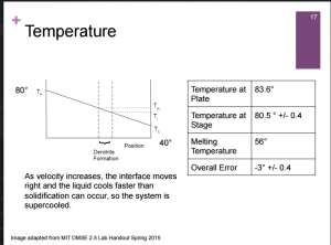
This is the first slide we had:

This slide is functional: all the information is present on the slide. There's a typical graph of temperature gradient vs position cited from our lab hand out. The table lays out the temperatures we read as well as the error. The caption for the graph describes what occurs.
The problems:
- The graph is not clearly labeled nor is it specific to our experiment.
- The graph is alright but could be connected to a graph/ schematic.
- The caption is long and wordy.

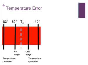
This is the schematic that I first created. I wanted to convey the physical set up of our experiment as well as create an icon that would clearly display 'temperature gradient.' Many people (especially scientists) over look how important visual presentation is; clear diagrams will save you many explanatory headaches and impress your audience. A clear icon or graphic will really clarify the experimental set up or goals.
By including labels of the temperature and areas of the stage, I was able to condense the information and link the table to the physical set up of our experiment. Similarly, this icon is readable at a single glance with a clear bold design.

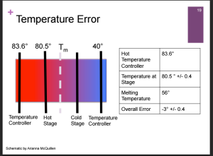
This is the final slide: by adding a color gradient, we reinforced the idea that the temperature was a gradient going from hot to cold. Everything is in a large readable and consistent font. The slide is fairly clear and uncluttered; all of the relevant data is presented to be seen at a glance even from the back of the room. There's no extra information nor are there full sentences.
The table of numbers becomes linked to the schematic as the audience can link the precise numbers on the schematic closely to the numbers on the table.
The fixes:
- Link the schematic to our specific experiment
- Link the schematic to the table
- Label all materials clearly
- Decrease clutter on slides
Having a bit of time away from the slide, I can see a few minor improvements. I'm still satisfied with what we produced, but it's always good to continue to look for ways to convey information clearly and cohesively.
Additional changes:
- Looking at the material now, I would probably redesign the table of data.
- I would add an arrow below the schematic to show the direction the material was pulled.
No comments :
Post a Comment